I thought it might be useful to share some tips and learnings I've gathered when building sites in html and css. In particular I am going to focus on:
- cross browser resets
- responsive html/css
- namespaced object orientated css
1) First we need to start with some basic html
index.html
<!doctype html>
<html>
<head>
<meta charset="utf-8" />
<title>Example</title>
<link href="css/reset.css" rel="stylesheet" />
</head>
<body>
</body>
</html>
2) Then inside the body tags we can add some example content of a navigation and information panel
index.html
<div>
<ul>
<li><a href="#">Donec id</a></li>
<li><a href="#">Elit</a></li>
<li><a href="#">Non mi portas</a></li>
<li><a href="#">Gravida</a></li>
</ul>
</div>
<div>
<img src="images/landscape.jpg" alt="image" />
<h1>Donec id elit non mi porta gravida at eget metus.</h1>
<p>Donec sed odio dui.</p>
<p><a href="#">View details »</a></p>
</div>
<div>
<p>© kmturley 2012</p>
</div>
3) We need to reset some styles so that any layout or theme we apply on top will all react in the same way. You can use a reset stylesheet such as css reset or normalize. However I prefer to only reset certain elements, so lets create a file called reset.css and only put css targeted at elements.
reset.css
body {
margin: 0;
overflow-x: hidden;
}
h1, h2, h3, h4, h5, h6, p {
font-weight: normal;
margin: 0;
padding: 0;
}
a {
outline: none;
text-decoration: none;
}
iframe, img {
border: 0;
}
ul {
list-style-type: disc;
}
form, input, textarea, select, fieldset {
margin: 0;
padding: 0;
font-family: inherit;
font-size: inherit;
font-weight: inherit;
}
5) Looks a bit neater with some resets! For a site with a grid of rows and columns we need some building blocks which are standardised, so lets define a layout.css
layout.css
.container {
max-width: 980px;
margin: 0 auto;
}
.row {
margin-right: -20px;
overflow: auto;
}
.col {
float: left;
padding-right: 20px;
-webkit-box-sizing: border-box;
-moz-box-sizing: border-box;
box-sizing: border-box;
}
6) we can also add some responsive rules to work for modern browsers IE9+ which will resize our rows and cells accordingly.
layout.css
/* width percent */
.w1of1 { width: 100%; }
.w1of2 { width: 50%; }
.w1of3 { width: 33.33333%; }
.w2of3 { width: 66.66666%; }
.w1of4 { width: 25%; }
.w3of4 { width: 75%; }
.w1of5 { width: 20%; }
.w2of5 { width: 40%; }
.w3of5 { width: 60%; }
.w4of5 { width: 80%; }
/* 20em = 320px */
@media (max-width: 20em) {
.flow-xs.col,
.flow-xs .col {
width: 100%;
}
}
/* 30em = 480px */
@media (max-width: 30em) {
.flow-s.col,
.flow-s .col {
width: 100%;
}
}
/* 48em = 768px */
@media (max-width: 48em) {
.flow-m.col,
.flow-m .col {
width: 100%;
}
}
/* 64em = 1024px */
@media (max-width: 64em) {
.flow-l.col,
.flow-l .col {
width: 100%;
}
}
/* 80em = 1280px */
@media (max-width: 80em) {
.flow-xl.col,
.flow-xl .col {
width: 100%;
}
}
7) We now need to update our html to use the new row and cell classes also adding a couple of extra divs and the layout stylesheet.
index.html
<div class="container">
<div class="row">
<div class="col w1of1">
<img src="images/landscape.jpg" alt="image" class="w1of1" />
<h1>Donec id elit non mi porta gravida at eget metus.</h1>
<p>Donec id elit non mi porta gravida at eget metus. Fusce dapibus, tellus ac cursus commodo, tortor mauris condimentum nibh, ut fermentum massa justo sit amet risus. Etiam porta sem malesuada magna mollis euismod. Donec sed odio dui. </p>
<p><a href="#">View details »</a></p>
</div>
</div>
</div>
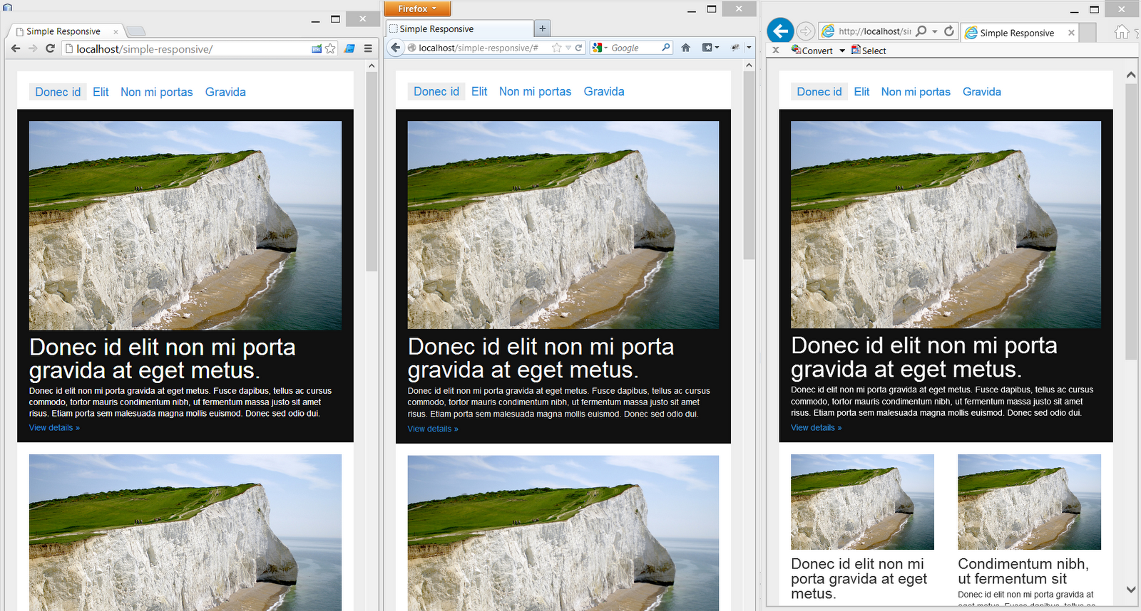
8) Now you can resize your browser and see the responsive rules in action! Lets add some extra cells inside each row to see the percentage rules working effectively
index.html
<div class="container">
<div class="row">
<div class="col w1of2">
<img src="images/landscape.jpg" alt="image" class="w1of1" />
<h1>Donec id elit non mi porta gravida at eget metus.</h1>
<p>Donec id elit non mi porta gravida at eget metus. Fusce dapibus, tellus ac cursus commodo, tortor mauris condimentum nibh, ut fermentum massa justo sit amet risus. Etiam porta sem malesuada magna mollis euismod. Donec sed odio dui. </p>
<p><a href="#">View details »</a></p>
</div>
</div>
</div>

9) All very nice but that's only the elements reset and the layout working responsively. Lets create a theme/skin/style for the site now. As always we need to namespace our styles so we don't conflict with anything else so lets create themes.css which will contain our default theme:
themes.css
.default {
font-family: 'Lato', Arial, sans-serif;
font-size: 0.875em;
color: #444444;
background-color: #ffffff;
}
.default h1 { font-size: 3em; }
.default h2 { font-size: 2em; }
.default h3 { font-size: 1.5em; }
.default h4 { font-size: 1.286em; }
.default h5 { font-size: 1.143em; }
.default h6 { font-size: 1em; }
.default p {
line-height: 1.429em;
padding: 0 0 0.715em 0;
}
10) After setting the defaults for the entire site we can create specific themes which we can choose to apply to a certain section or elements so it's important to use classes only (never ever use id's or dom elements as selectors)
themes.css
.light {
color: #333333;
background-color: #ffffff;
}
.light .c1 {
color: #333333;
}
.light .c2 {
color: #2989D8;
}
.light .c2:hover {
color: #71A8D6;
}
.light .bg1 {
background-color: #ffffff;
}
.light .bg2 {
background-color: #eeeeee;
}
.light .bg3 {
background-color: #aaaaaa;
}
11) we can now apply the theme stylesheet and classes to the html
index.html
<div class="container">
<div class="row light">
<div class="col w1of1">
<img src="images/landscape.jpg" alt="image" class="w1of1" />
<h1 class="s1">Donec id elit non mi porta gravida at eget metus.</h1>
<p>Donec id elit non mi porta gravida at eget metus. Fusce dapibus, tellus ac cursus commodo, tortor mauris condimentum nibh, ut fermentum massa justo sit amet risus. Etiam porta sem malesuada magna mollis euismod. Donec sed odio dui. </p>
<p><a class="c2" href="#">View details »</a></p>
</div>
</div>
</div>
12) Now we have themes up-and-running you can switch the light theme class name to switch the theme on an entire section without needing to change the classes below. Lastly we need to make site specific changes such as aligning the nav items. guess what? we should be namespacing this too!
modules/nav.css
.nav li {
display: inline-block;
margin: 0 0 5px 0;
}
.nav a {
padding: 5px 10px 5px 10px;
}
So there we have it, a finished working cross-browser responsive site. In older browsers what will happen?
IE8 supports percentages but not responsive css, so it will retain the cell layout whatever the width of the users browser. If you would prefer you can move the max-width attribute to a responsive rule so IE8 will stay a fixed width site no matter what.
You can download and view the final code on my github account at:
https://github.com/kmturley/alley
Hope that helps you get a responsive site working faster!